Hahnemühle fine art photography paper: which is best?
German paper manufacturer Hahnemühle is one of the oldest companies in the world, stretching all the way back to 1584 (!). The company produces a variety of papers for digital inkjet photo printing, including a well respected line of fine-art, museum quality papers. In this review, I'll print a color and black and white image on four Hahnemühle papers fine art papers, including:
- Hahnemühle Photo Rag Baryta
- Hahnemühle Matte Photo Rag Baryta
- Hahnemühle Photo Rag Ultra Smooth
- Hahnemühle William Turner Matte Textured
How is fine art paper different?
Fine art photography paper is typically constructed using 100% cotton rag, which is less acidic and higher quality compared to the wood pulp used in basic, conventional photo paper. They are also often manufactured without the optical brighteners (known as "OBAs") used in commercial printing, which helps resist fading and yellowing over time.
Fine art photography paper is also thicker, weightier, and more substantive, with more finish options besides glossy, luster and semi-gloss. Texture is also a key component, with some papers (like the William Turner) resembling the look and feel of canvas.
All four Hahnemühle fine art papers — Photo Rag Baryta, Matte Photo Rag Baryta, Photo Rag Smooth — have a GSM (Grams Per Square Meter) value averaging 310. For comparison, Canon/Epson inkjet photo paper is around 250 GSM, while cheap photo paper is around 100-130 GSM. This makes the Hahnemühle papers heavier and more premium feeling. Certain inkjet printer models may require using their rear, manual feed to accommodate the extra thickness.
Those qualities do come at a cost, of course, with fine art paper typically costing more per sheet than conventional photo paper, and Hahnemühle is one of the most expensive brands. Each sheet of Hahnemühle 13x19" (A3+) paper in this review costs $6 on average. For comparison, 13x19" Canon Luster paper costs $1.50 per sheet. That's almost 4x more per sheet!
That price difference would certainly add up over time if printing lots of images, but if you're a small batch printer like me, the cost is somewhat negligible. Way I see it, if I'm going to spend money on expensive archival inks and whatnot, I should also be printing on the highest quality paper. And at the end of the day, it's only a few dollars more per print, so for me the extra cost is worth it.
What is "Baryta" paper?
Two of the papers in this review are "Baryta" papers, which means they have been coated with barium sulfate to produce brighter, more neutral whites. Note that this is different from OBAs (Optical Brightening Agents), which is a chemical treatment used in commercial paper (eg, brochures, disposable printed ephemera, etc) to also make paper brighter and whiter. OBAs are harmful to image longevity, and can cause images to fade and turn yellow faster than normal. Thankfully, barium sulfate doesn't have that problem, and all four Hahnemühle papers in this review are OBA free.
Put simply, I picked two Baryta papers because I like how they look. To my eyes, Baryta more closely emulates the perceived luminance and color temperature of a computer screen (D65), so I like how exact it is. Not a huge difference compared to the natural tone of non-Baryta paper (like the Ultra Smooth and William Turner papers in this review), but I like how it looks.
Hahnemühle paper comparison
When you buy a box of Hahnemühle paper, it comes in a sturdy cardboard box with a handful of printed documents containing instructions for storing and maintaining the paper. To learn which printer settings you should use with each paper, you must download ICC profiles from Hahnemühle for the specific paper and inkjet printer you are using. This ensures you get the best possible image when printing.
For comparison, I printed the same color and black and white image on all four papers using a Canon Pro 300 printer, Canon's Professional Print and Layout software, plus the appropriate Hahnemühle ICC profiles for each paper (not the printer's dedicated black and white mode).
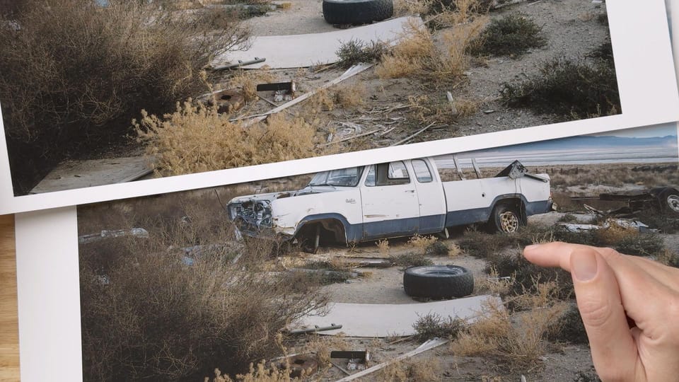
Hahnemühle Photo Rag Baryta ($6.60 per sheet, link)
According to sales on B&H, Hahnemühle Photo Rag Baryta is one of the most popular Hahnemühle fine art inkjet papers. Which makes sense, for it has a beautiful soft gloss finish that gives your image that wet look, but without being too glossy or cheap looking. There's also a subtle grain in the paper, visible mostly in reflected areas.
Like most glossy and luster papers, Photo Rag Baryta has a lower d-max, which is a fancy way of quantifying how black the blacks are. This produces richer, more contrasty images containing more depth than smooth or matte papers. Subjects have more shape and dimension. The paper also supports a wider color gamut, with a broader range of printable colors. Detail and clarity is also excellent with this paper.
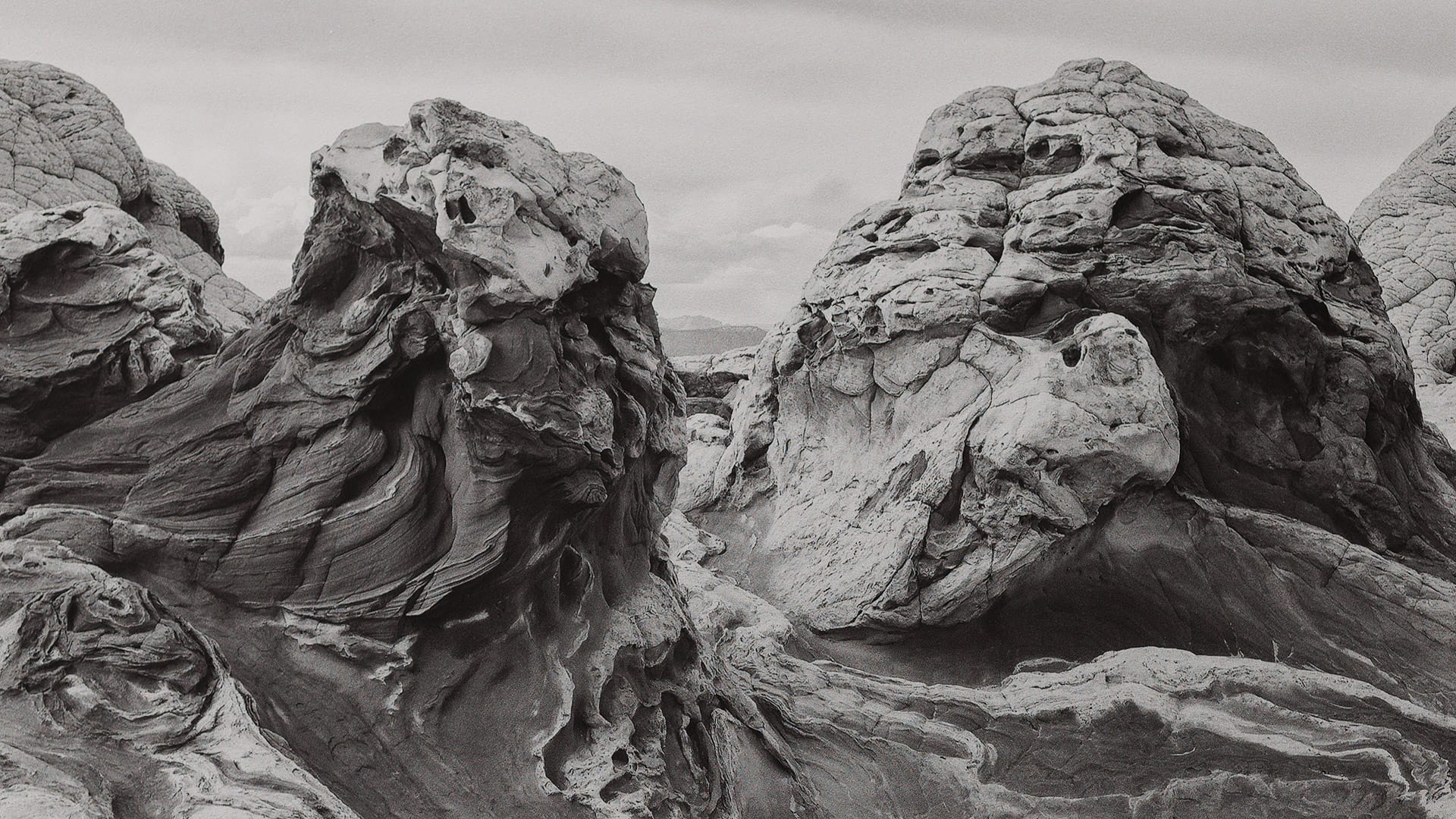
Photo Rag Baryta is a solid choice for photographers who want cleaner, more neutral whites, plus stronger blacks and more vibrant colors. If your images have these characteristics, Photo Rag Baryta would be a good pick. Glossy isn't my preferred finish (I'm more of a matte guy), but it's impossible to deny how rich and punchy color and black and white images look. Just remember that the paper will catch and reflect light. Of all the papers in this review, Photo Rag Baryta has the deepest blacks and best overall detail.
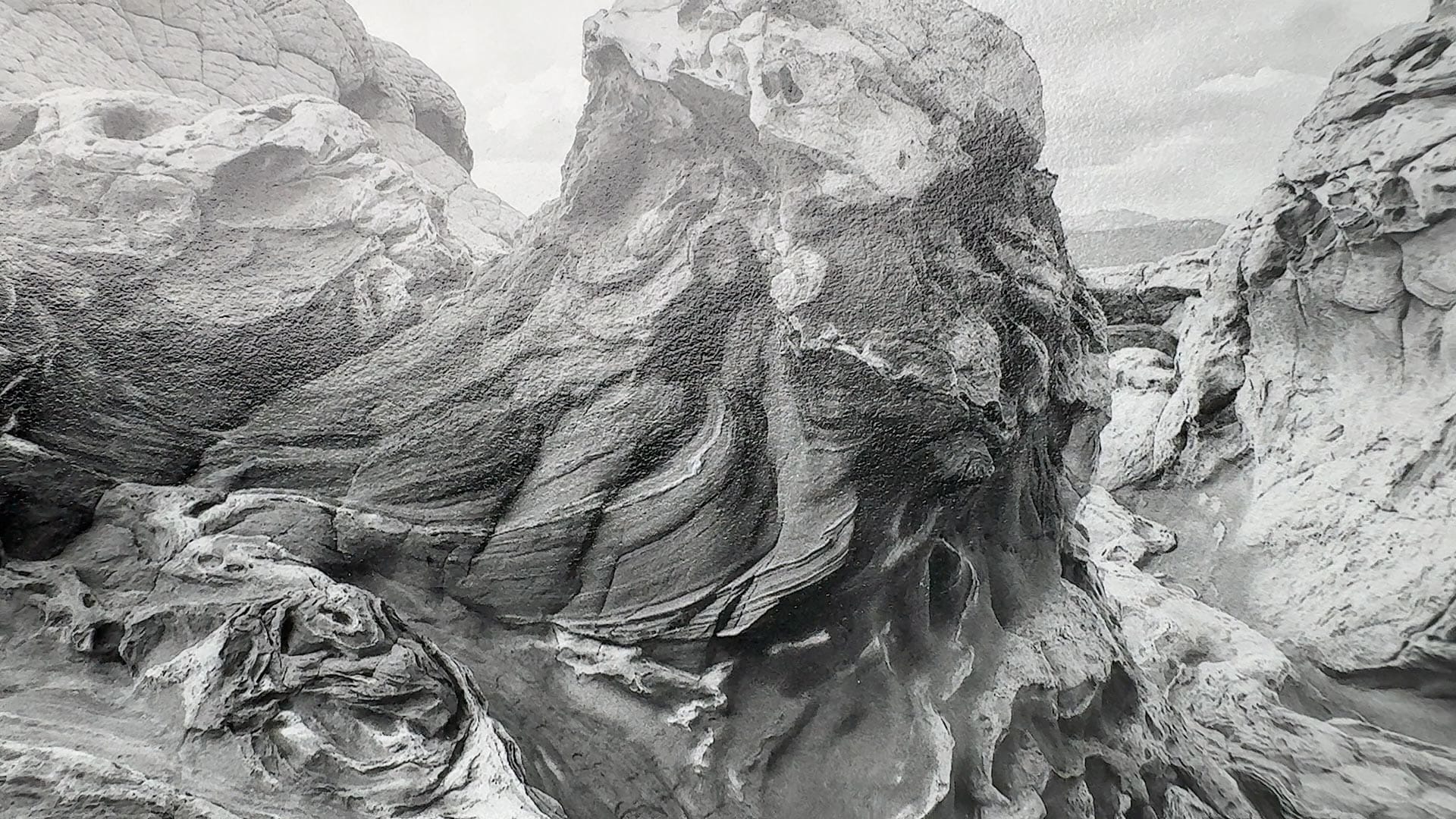
Hahnemühle Photo Rag Matte Baryta ($6.10 per sheet, link)
At the time of this review, this is a new Hahnemühle fine art photo paper option. It has the same neutral white balance and brighter whites of the aforementioned glossy Baryta, but with a more subdued matte finish. The paper does not reflect light, and looks the same from all viewing angles.
Like all matte papers, Photo Rag Matte Baryta has a softer, more low-key appearance. Blacks are slightly brighter, with a flatter, more faded look. Overall contrast is just a little softer and less punchy.
But what really surprised me about the Photo Rag Matte Baryta is how well it handles detail and texture. It looks almost exactly the same as the glossy Baryta, which normally isn't the case with matte paper. Perhaps it's the barium sulfate coating that is doing a better job of holding details together, but whatever is happening, Photo Rag Matte Baryta is uncommonly good.
Black and white is where this paper really sings. Those aforementioned details and textures really stand out. Compared to the glossy Baryta, the color temperature is even more neutral and exact, producing black and white images that appear truly monochromatic. The blacks don't have quite as much punch as the glossy Baryta, but I like their slightly faded look.
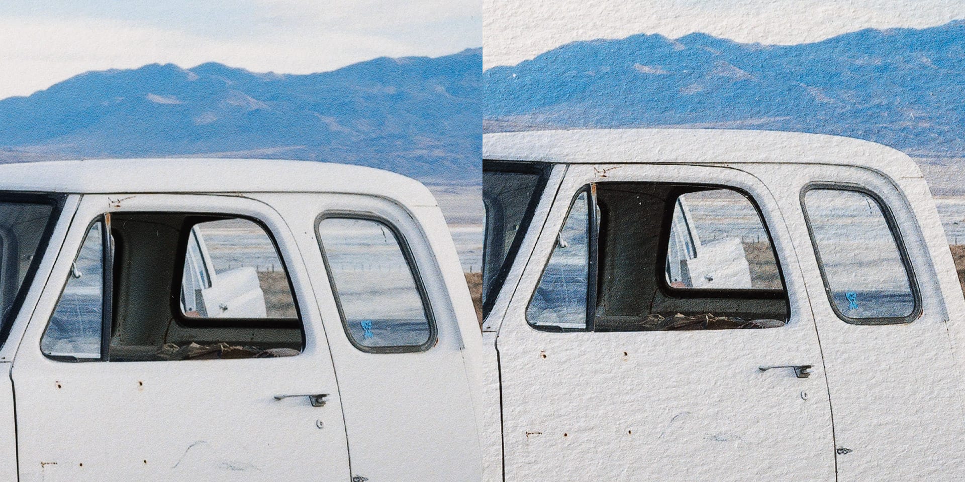
Hahnemühle Photo Rag Ultra Smooth ($5.48 per sheet, link)
Photo Rag Ultra Smooth is a non-Baryta paper, so there's no barium sulfate coating to punch up the whites. Instead, you see the natural color temperature of the paper, which to my eyes leans a little warm. This isn't a bad thing, for that non-neutral base makes whites and neutrals appear a little warmer and richer, and warm hues in color images tend to get a little more vibrant. Put simply, the white point of Photo Rag Ultra Smooth looks like paper, while the Baryta papers look more "digital", if that makes sense.
Photo Rag Ultra Smooth is named "smooth" because the paper finish is flat and textureless. There's literally no texture or grain at all, with a non-reflective coating that looks the same from all viewing angles. When printing color images, yellows and oranges look a little more vibrant, neutrals appear warmer, and contrast is lifted similar to a matte paper.
You really see the inherent color in the paper when printing black and white. Print a perfectly neutral, non-toned monochromatic image on Photo Rag Ultra Smooth, and the grays and blacks lean warm. The image looks like it has been subtly toned prior to printing. Some photographers may prefer the more natural, toned look of Ultra Smooth when making black and white prints, but I'd likely stick to printing color on this paper.
Hahnemühle William Turner Textured ($5.50 per sheet, link)
Of all the papers in this review, William Turner Textured has the most character and personality. As its name implies, the paper is textured, which means the fibers stand up and catch the light. Subtle, raised ridges lift image details and textures and give them a three dimensional look. It's hard to describe, but images printed on William Turner feel like they're inside the paper, as opposed to layered on top. There's a subtle visual depth that goes beyond contrast. William Turner would be a great paper choice for reproductions of fine art paintings, for its texture would give lift to brush strokes.
When color images contain detail and texture, William Turner looks amazing. When they don't, or some areas of the image have flat color and tonality (eg, a sky), paper texture is more noticeable. To my eyes, it almost looks like artificial grain or noise was added to an image prior to printing, which may be distracting. Detail retention is good for a matte textured paper, but obviously not as sharp and detailed as the other papers.
Black and white images are the same. In areas with detail and texture, William Turner is beautiful. Being a non-Baryta paper, neutrals do appear just a touch warmer than they do on screen. Contrast is more subtle, and blacks have a fade similar to the aforementioned Matte and Ultra Smooth papers.
Overall, images printed on William Turner have a more organic, painterly vibe compared to the clean, textureless finish of the other three papers. Prints look more like artwork and less like photographs. When it works, William Turner is phenomenal, especially for detail rich color images. But I don't think it looks as good with softer, low-contrast images, or images with flat areas of color and/or tonality.
Final thoughts about each paper
Overall, I'm a big fan of Hahnemühle paper. There are of course plenty of other paper brands out there, most of which cost less in comparison, but because I'm very selective with my printing, and not printing in volume, I don't mind the higher cost per sheet. For me, Hahnemühle paper is worth it.
At the end of the day, if I had to pick one Hahnemühle fine art paper for color and black and white, I would use Photo Rag Matte Baryta.
For me, it's literally the best of both worlds. Similar detail and contrast compared to its glossy sibling, but with a non-reflective matte finish. It was the most neutral of all four papers, with grays that appear almost perfectly neutral. Finally, the barium sulfate coating makes the whites sing. I'm a big fan of how it looks.
Honestly though, you really can't go wrong with any of the fine art papers featured in this review. There are no right or wrong answers when picking one. The key is selecting a paper with the right finish and personality for the type of photo you are printing. In my experience, papers with opposite characteristics from an image often work better. For example, a soft, low contrast image can appear dull and lifeless on matte paper, but satisfyingly rich on glossy. High contrast, colorful images can look busy and "digital" on glossy, but more subdued on matte.
If you'd like to purchase any of the Hahnemühle papers featured in this review, here are links to each at B&H. In full disclosure, these are affiliate links, which means I would receive a small referral commission, but at no additional cost to you.
- Hahnemühle Photo Rag Baryta
- Hahnemühle Matte Photo Rag Baryta
- Hahnemühle Photo Rag Ultra Smooth
- Hahnemühle William Turner Matte Textured
Additionally, the company also offers affordable sample packs, each with a variety of papers to experiment with. These would be a great way to see which papers you prefer most, if printing your own images.